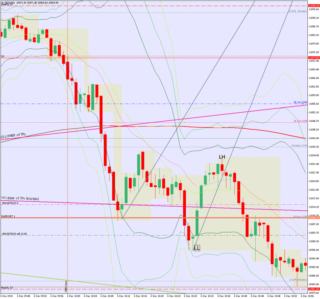
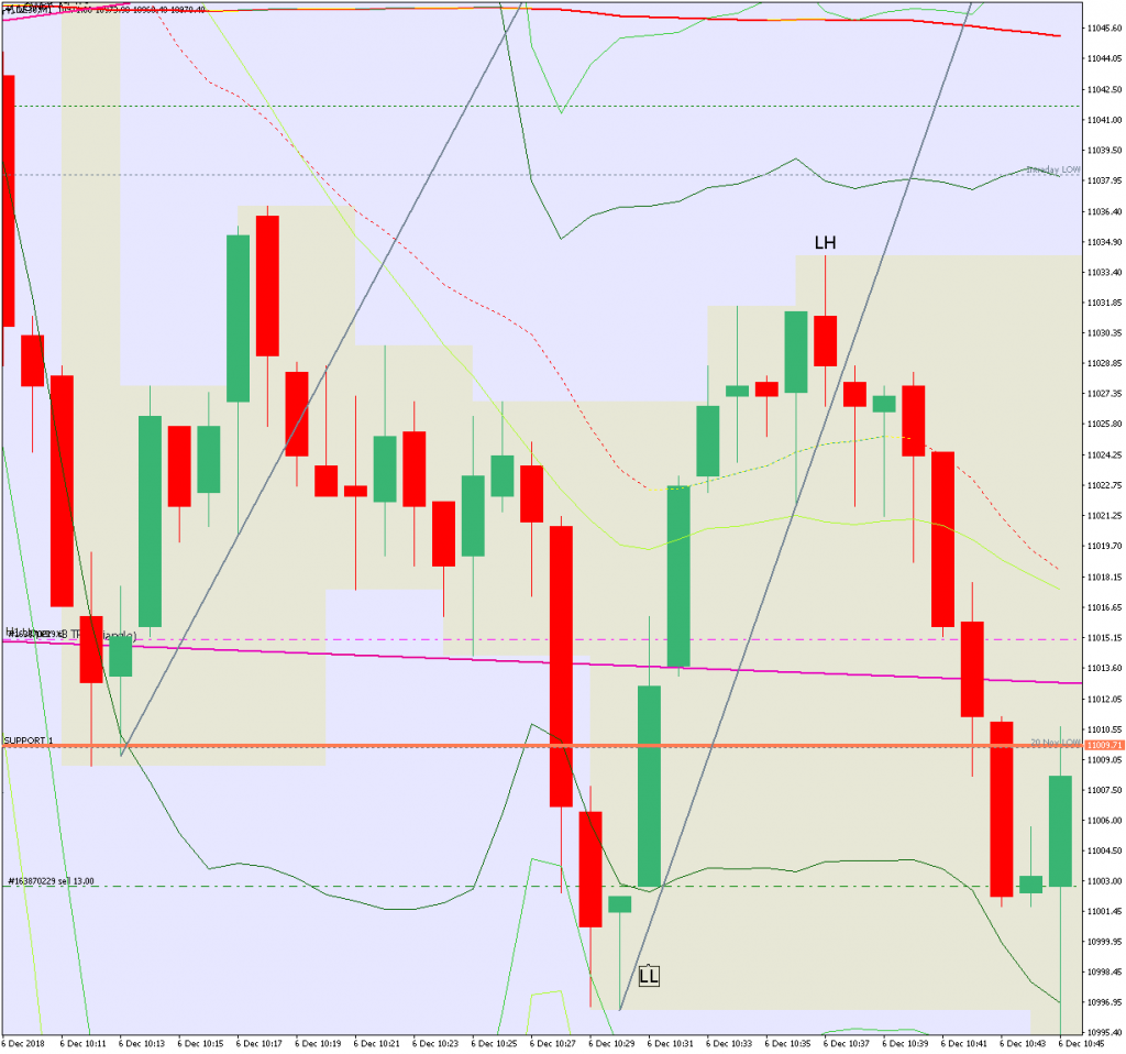
I wonder how much consistency is there in the PA before a break?
Sometimes it’s a very clear pattern, such as a triangle with a horizontal top for a break up and a horizontal bottom for a break down. It is also true that a compression is most likely to break in the same direction as the market moved into it but that will also depend on levels.
This is what the PA looked like today – before a nice break down. The context for this chart was a strong down trend on all higher TFs.